These days, it seems like every day we learn of a new variant of SARS-CoV-2 (the virus that causes COVID-19). However, it’s hard to understand what a variant is and how it changes the virus. In this post, I wanted to introduce PyMOL, a program that students have access to through the University. This program can be used to see what the spike protein and its mutations actually look like.
But first, here’s some background on SARS-CoV-2: COVID-19 is a disease caused by a strain of coronavirus called SARS-CoV-2. This virus gets inside the human cells by using something called a spike protein. This spike protein binds to a receptor on the human cell called the ACE2 receptor, and this allows the virus to infiltrate the cell. The variants of SARS-CoV-2 that we keep hearing about typically have different mutations on the spike protein. In the case of the B.1.1.7 variant, which is a variant that is thought to be 30-50 percent more infectious than other variants in circulation, the mutations are at a location that allow the spike protein to bind better to the ACE2 receptor. If you bind better to the receptor, you’re better at infiltrating the cell. The spike is also the target of the vaccine and our natural immune system.
Now, let’s try and look at where these mutations actually are.

Getting Access to PyMOL
The program you use to look at protein structure is called PyMOL. PyMOL can easily be downloaded from the internet. When you open up the application, you’ll get a message that asks if you have a license file. While you would normally need to buy a license, you can just connect to the University Sonicwall VPN (the instructions on how to get this VPN working on your computer are available here). Then, PyMOL will notice that you have an existing license (through the University) and you’ll be asked if you want to use that license. Click yes, and you’re all set!
Retrieving the Spike Protein Structure
Next, you need to actually download the spike protein structure. To do this, you want to go to a website called the Protein Data Bank, which contains published protein structures. These are structures of proteins that have been solved through various laboratory techniques. The ID of the spike protein is: 6VXX. You can download what is called the “PDB file” here. Or you can just type in “fetch 6vxx” where you see “PyMOL >” (see picture below). If you’re successful, you should see a stringy, cartoon appearance of the protein. To make this into a more “interpretable” image, just type in “show surface”, and you should see a bumpy blob — this is essentially what the surface of the protein looks like! (For those who are curious: the red parts are oxygen atoms and the blue parts are nitrogen atoms.) To make the structure the same color, let’s say white, type in the following command: “color white”.

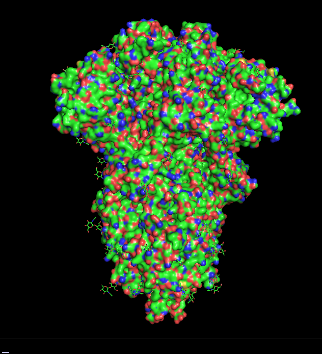
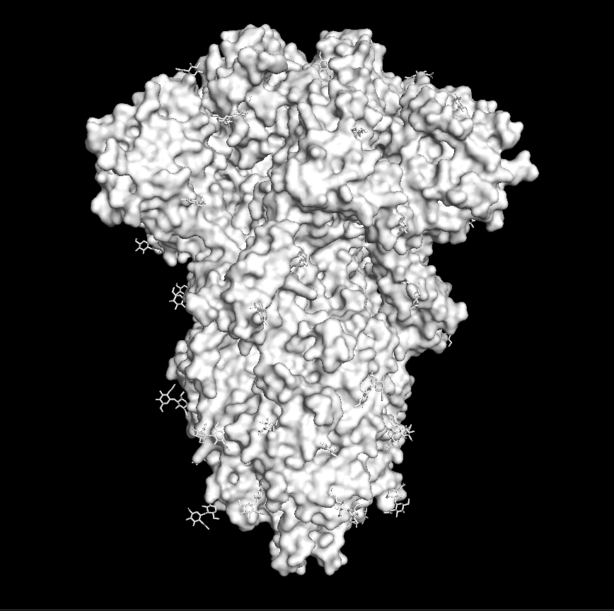
Right: type “color white” to make the protein white.
Looking at Mutations
Now, let’s try and visualize some mutations. Each variant of the coronavirus has multiple mutations. Mutations are changes in the DNA. The DNA codes for amino acids, and amino acids make up the protein. Changes in the amino acid cause the protein to change — in the case of B.1.1.7 variant, the changes let it bind to the ACE2 receptor better. (For more information on how changes in your DNA lead to changes in proteins, see this Khan Academy page.)
There are many differences between the “original” and the B.1.1.7 variant, but for this post, I wanted to just focus on one mutation. This mutation is called N501Y, and this change in the amino acid sequence is thought to make the binding between the spike protein and the ACE-2 receptor tighter.
To select this amino acid on the structure, type in the following command: “select resi 501”. Then, you can color this amino acid by typing “color red, sele”. Now, you should have an image of the spike with this amino acid highlighted in red. You should see three separate red spots (or three different highlighted amino acids) since the spike is actually made of three identical subunits — these three subunits are what scientists collectively call “the spike protein” (see the three subunits in the video below).

To look at other mutations in other variants, see this New York Times article that also gives great visualizations of each mutation and of different variants circulating around the world.
PyMOL is a tool that is used heavily in biology and chemistry. (You can look at this great introductory video for more insight on what you can do on PyMOL.) I’ve personally used it a lot for my computational senior thesis. I hope that this post was informative since this is a tool that many students, even those in the Molecular Biology department, don’t know we have access to through the University. The next time you hear about a coronavirus variant, try looking at where it actually is on the protein!
⎯ Nanako Shirai, Natural Sciences Correspondent
