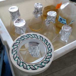
The doodles appear everywhere: on whiteboards, on lab notebooks, even on the autoclave tape. Impeccably shaded line drawings of a-helices, the protein structure nearly everyone in the lab works with. The “culprit”? Ann, the senior grad student in our lab. Her artistic skill is rare, or at least perceived as rare, in science. Rare enough that Grant, one of the post-docs in the lab, complains, besides a few exceptions, science is “full of nerds”, by which he means those without any creativity or broad interest. And that rarity is a shame, because science needs creativity. This isn’t just about a desire for amusing doodles, it’s about building a scientific community full of clear, intuitive thinkers who can communicate their discoveries.

Once upon a time, the protein-chemistry lore goes, everyone needed some artistic flair. Indeed, Jane Richardson, under whom my thesis adviser did his postdoc, is known as much for her artistic skill – hand-drawing so many diagrams of proteins in her field-defining papers that modern visualization software still largely uses the conventions she developed – as for her considerable scientific talent.
Now, due to that same software, and other software for visualizing other sorts of data, rapid and clean images of nearly any process, relationship, or other data are merely a few lines of code away. But when the graphics are automatically created with software, rather than by-hand, something is lost. It’s all-too easy to let visualization software become a crutch by presenting colorful pictures without paying mind to the aesthetic or narrative considerations of the medium. Visualization is about communicating our data, and if creativity and a good eye for clarity are no longer necessary to make colorful images, it only means that it’s easier to become a scientist without learning how to present information, not that it’s any less necessary to communicate clearly and creatively once you’re a scientist. Complaints by design-conscious scientists that posters, presentations, or figures contain font vomit, poorly-considered color schemes, or visual clutter are common, and point to a larger point, often missed in science.
It is all-too-easy for brilliant work to fail to contribute because its discoverer lacks breadth.
As we were told over and over again in the Chemistry Department’s junior seminars, research isn’t just about discovery, but about the communication of that discovery. This communication requires not just skillful writing, but clear and creative design of visual media for presenting the information, lateral thinking about the implications or importance of discoveries. The ideal of a scientist as a monomaniac “nerd’ tooling away at a single project is unfortunately prevalent; while such researchers may occasionally make brilliant and high-profile discoveries, these discoveries are only significant when communicated and understood within the wider context; it is all-too-easy for brilliant work to fail to contribute because its discoverer lacks breadth or the ability or willingness to communicate.
What should we take from this? Self-proclaimed “creative types”: science needs you. To think laterally rather than linearly, to understand and communicate the importance of discoveries, to make science interesting and relevant and helpful. Don’t let the monomaniacal outliers scare you away. And if you think of yourself as a nerd? Branch out. Theater, poetry, graphic design… pursuing random interests or passions may seem unrelated to your research, but definitely makes you a better scientist.
– Bennett McIntosh, Natural Sciences correspondent

