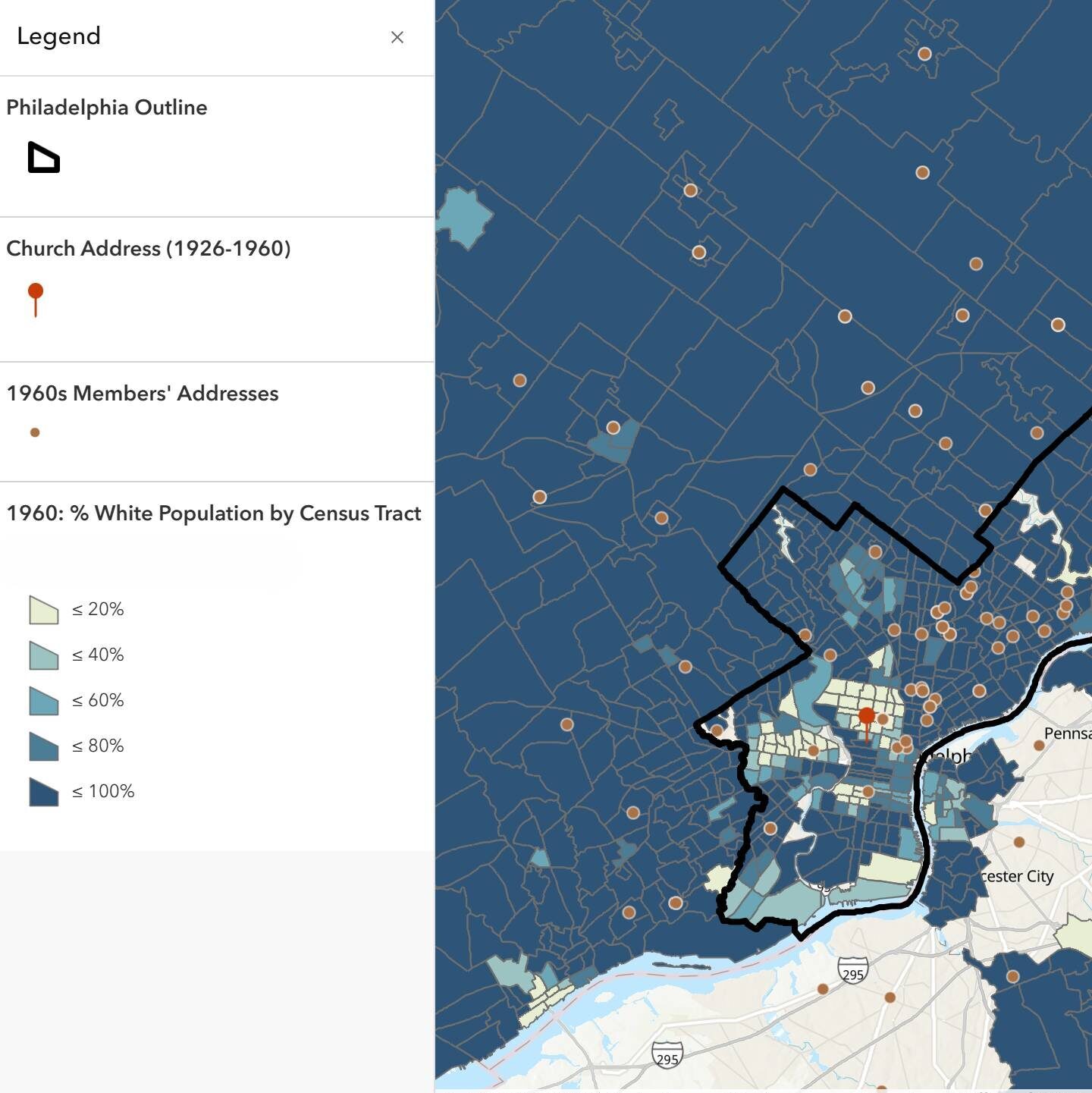
In my junior paper, I explored how the racial demographics of a Philadelphia church transformed from exclusively White to predominantly Black within a few short years. I started this project in the archive, looking for any documents that could point to when and how the church’s congregation began to transform. In minutes recorded of church meetings, I identified a period of white flight, where the neighborhood around the church became increasingly non-White, and, in response, many of the church’s White members relocated to the suburbs. I knew that I could describe this congregational migration in a written narrative, but I also wanted my readers to be able to visualize it, so I turned to digital mapping.
As someone in the social sciences/humanities whose research is primarily qualitative, I had no idea where to get started with a project like this. My first step was consulting with Princeton’s GIS librarian, who helped me take stock of the kinds of materials I had and the kinds of projects I could produce with them. (I found the GIS librarian under “Services” on the library’s website, where there’s also information on many other subject specialists and research centers, which can help you kickstart any kind of projects). With his guidance, I decided to use a collection of six thousand church membership cards, which dated back to 1897, and extract the residential addresses of the church’s members over time. When grouped by time period and mapped with evolving racial demographics in Philadelphia, I would be able to visually represent congregational white flight.
Over the next few weeks, I transcribed the data from the membership cards into a spreadsheet and standardized it so that it could be easily processed by ArcGIS, the mapping software that I was using. ArcGIS would transform my written address data into points on a map.
When it came time to actually map the data, I returned to the GIS librarian, I went to the McGraw Center’s Digital Learning Lab (DLL), and I enrolled in REL255: Mapping American Religion, which all helped me develop the technical skills I needed to complete my project. The GIS librarian helped figure out the technical details of creating my specific project, the DLL helped me with more general questions like organizing my data and accessing different web resources, and my mapping class helped me think about how to best present my mapping project to different audiences. (Some other classes that could be really helpful with learning mapping skills for the social sciences and humanities are URB385: Mapping Gentrification and HUM346: Introduction to Digital Humanities, which is being offered this spring). I did not have to pay for any mapping software subscriptions, as the GIS librarian showed me how to access ArcGIS for free on my personal devices using Princeton’s institutional subscription.
In ArcGIS, I was able to convert spreadsheets of home addresses into plotted points on a map. I also learned how to extract and map racial demographic census data to show how the racial demographics of specific regions have changed over time. In the end, I had a comprehensive map that visually represented the process of congregational white flight, which was the perfect companion to the written work of my JP. I also used some of ArcGIS’ other tools, like StoryMaps, which allowed me to create an interactive web map version of my JP.
Learning new digital tools can be very daunting, especially for people in the humanities and social sciences who (like me) are less familiar with quantitative methodologies. However, digital projects like these can deepen and enrich the questions that we ask and the answers that we find. Princeton also has so many resources available that make learning a new skill like this manageable. If you have data that could be spatially represented, consider adding a digital mapping component to your project!
—Alison Fortenberry, Social Sciences Correspondent

