It’s said that a picture tells a thousand words; a map, however, can tell you a million.
To me, maps are not just tools for navigation. They have a variety of uses, enabling their creators to visualize a vast array of data efficiently and quickly. From questionable election forecasts to the location of monuments in a city, anything of your choosing can be mappable. Maps, in my experience, can be one of the most powerful tools in your research toolbox. Thus, I want to show you how you can use maps in your research, and the power they hold!
When I use maps, I do not ‘draw’ them. As I learned in my freshman seminar last spring, FRS 174: The Science and Art of Mapping the World, maps can be created using digital software. Many of the maps you see in research papers or presentations are made with geographic information system (GIS) software, which allows users to capture, analyze, and visualize spatial data. This is typically done by adding layers of data, which symbolize different features of a map. These layers can either be vector data, which represent the data points as shapes or lines on the map, or raster data, which are images of the geography itself. There are two software that I have experience with: QGIS, which is an open-source GIS program, and ArcGIS, which is a little more official. For the purposes of this post, I will be using QGIS.
I know – learning a new software is scary. But this isn’t like learning a new coding language (even though there are elements of that). GIS software, after you get exposed to it, becomes incredibly intuitive. So, I will be walking you through the steps of how to create a simple vector map on QGIS. So, let’s get to mapping!
- Download QGIS. You can find the source for the download here.
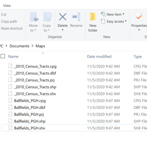
- Download some shapefiles. Shapefiles are vector data, or rather point data. These will manifest as points and shapes on your map. For the purposes of this map, we will download the 2014 census tracts of my hometown, Pittsburgh, PA. We should also download, just for fun, all of the ballfields in the city as well! Upon download, it is important to extract all of the files in the zipped folder to a location of your choosing. To find data on your own, I would recommend checking out your local municipality’s open data source (if they have one!) or Princeton’s own library service to find and locate GIS data.

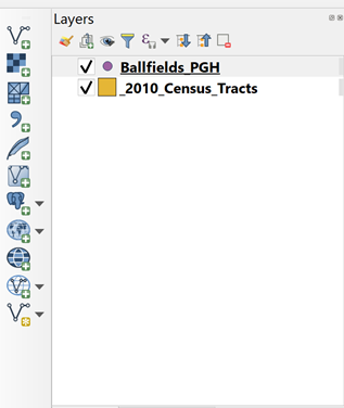
- Upload your vector layers onto a map. With QGIS and all of your files downloaded, it is now time to create a map! Open QGIS and select the “Add vector layer” button. Go to the folder with your shapefiles in it. Select the files that end with “.shp.” DO NOT, however, delete any of the other files in that folder. These files are necessary for the functioning of the shapefile. After downloading, they will appear in a taskbar called “Layers.” You shift them around to change their ordering on the map.

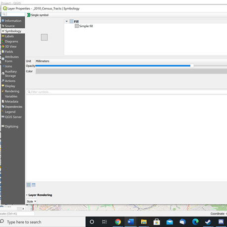
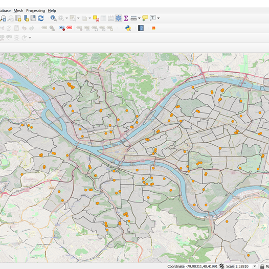
- Look at your map. Now, with your vector layers uploaded, you should have something that looks like a map. Each dot represents a ballfield, while all of those scraggly shapes represent census tracts in Pittsburgh, PA. From here, you can stylize the symbology of the map. Click on the “_2010_Census_Tracts” layer and it should open a screen called “Symbology.” This will allow you to edit the appearance of the point data, including color, shape, size, opacity, etc. Let’s change the color and opacity of the census tracts. Change the color to gray and reduce the opacity to 50%. This makes the map very translucent, allowing the point data to stand out.

- Add the OpenStreetMap (OSM) layer. Census tracts might not be enough to understand the location of the ballfields, so we can add a layer called OSM. OSM is a Google Maps-style digital map, complete with place names, roads, parks, and other geographic features. It will be used to contextualize the location of our ballparks in the map. In your taskbar called “Browser,” under XYZ tiles, there should be something called “OpenStreetMap.” Click on it. A digital street map of the area will pop up. Make sure your shapefile layers are on top of the OSM layer so it can be seen.
- Look at the map. Often, when I complete my maps, I like to ask myself several questions on the matter of interpretation. What do I see? What are some of the patterns on my map? What are some things that just don’t make any sense? These questions help sharpen my analysis, as it helps pick at some of the core takeaways of this digital mapping exercise.
- Save your map. When done, save your map. As a tip, to avoid losing any progress, save regularly.

And with that, we have created an amazingly simple map of ballfields in Pittsburgh! This exercise introduced some of the basics of using GIS tools, but it barely scratched the surface. If you are interested in learning more, there are many great in-depth GIS tutorials for you to use. QGIS, for instance, maintains its own tutorial documentation for new users. You can also check out the different workshops Princeton offers on the topic as well! If you would like some reading, I would recommend Mark Monmonier’s How to Lie with Maps, where he goes into different types of maps, data visualization, and other topics important to digital cartography.
– Austin Davis, Humanities Correspondent

