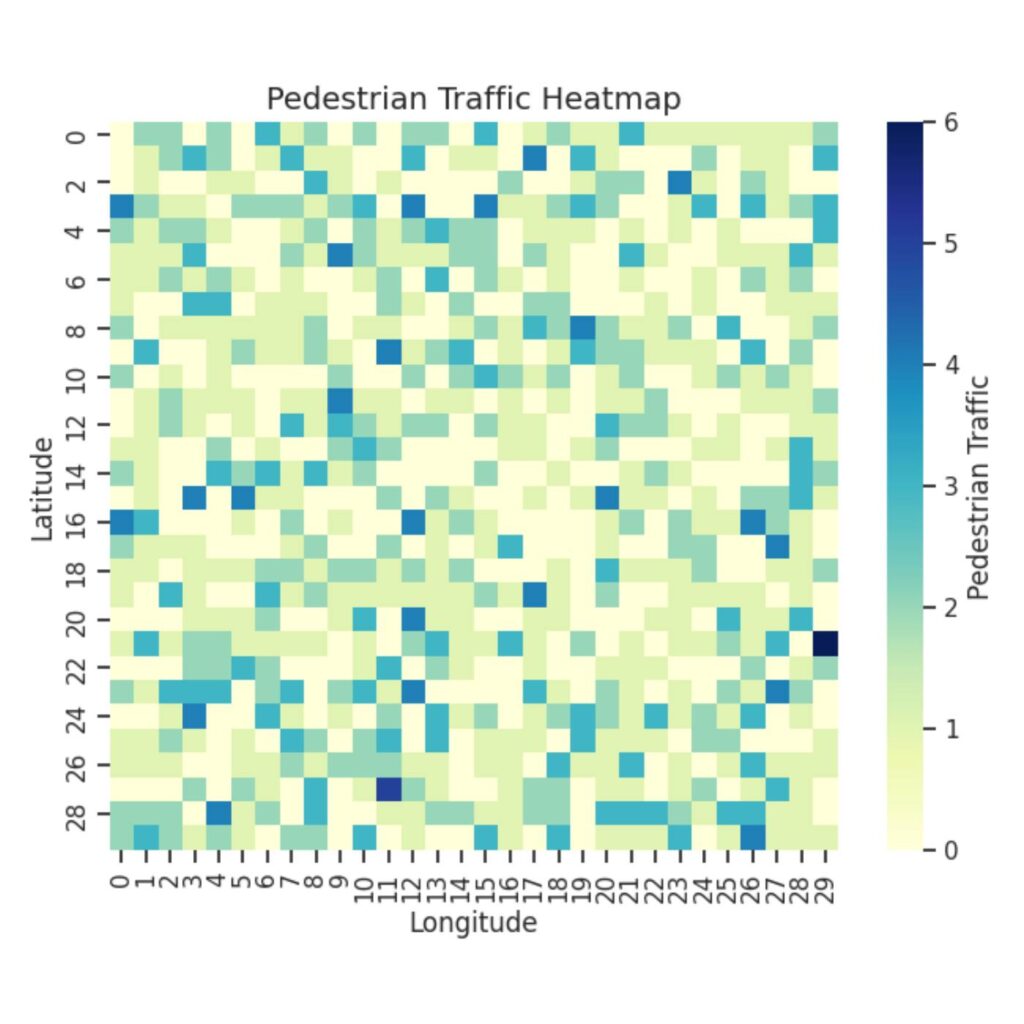
Data is everywhere. Whether it’s to track your music listening habits, analyze stock market trends, or understand scientific research, data is most valuable when it can be easily interpreted. This is where data visualization comes in: to transform raw data into clear, engaging visuals.
The Princeton University Library has a wealth of resources and research guides, including guides tailored specifically to data visualization in programming language R and statistical software Stata (often used in economics courses). However, not as many PUL research guides are currently available on data visualization in Python. If you haven’t heard of Python before, it’s a popular programming language that can tackle a versatile range of applications, including data analysis and artificial intelligence. While Stata and R are both excellent choices for statistical analysis and visualization, Python stands out for its flexibility, interactivity, and seamless integration with web development and machine learning applications.
In this article, I wanted to present a commonly-used Python library for data visualization: Matplotlib. By learning how to use Matplotlib, you’ll be able to take your data and turn it into visuals that communicate your findings effectively—a key skill whether you are analyzing survey results, studying statistics, or working on research projects!
Matplotlib is one of the most powerful libraries in Python for data visualization. This library can be an essential tool for undergraduate students, helping you make sense of the data in your assignments, projects, or research. Whether you’re a beginner or an experienced data scientist, Matplotlib is a great resource for both fairly basic data visualizations and more complex tasks. It’s highly customizable and can generate a wide variety of plot types, including line graphs, bar charts, histograms, and scatter plots. It also integrates seamlessly with other Python libraries like NumPy, making it an ideal choice for visualizing scientific and analytical data.
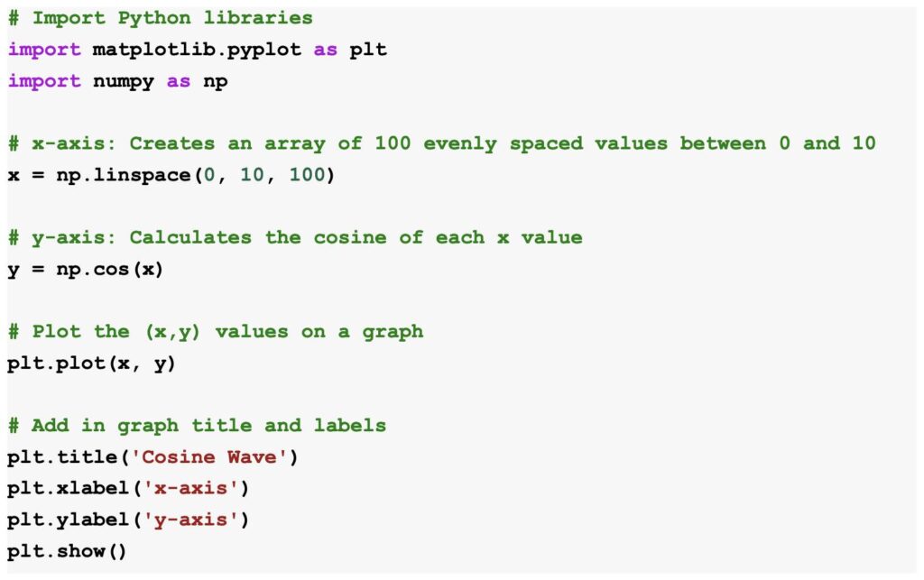
Here’s a simple example of how to create a line graph using Matplotlib:


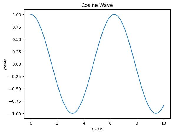
This code creates a plot that shows the cosine wave! An important step is including the first line, which imports the Matplotlib library and allows you to start calling functions like plot() and title() to create and label your graphs. With just a few lines following that import statement, you’ve created a clear graph that anyone can understand! Moreover, the room for enhancements is huge—you can add a legend if you have multiple plots, can change the color of graphs, and so on.
Ultimately, whether you’re analyzing data, exploring patterns, or presenting results, Python’s visualization libraries like Matplotlib can help you bring your data to life. To become more familiar with Matplotlib, I would highly recommend taking advantage of their User Guide and leveraging their Examples page. The more you experiment with these tools, the more comfortable you’ll become, and the better you’ll be at choosing the right visualization to tell your data’s story!
— Alexis Wu, Engineering Correspondent

