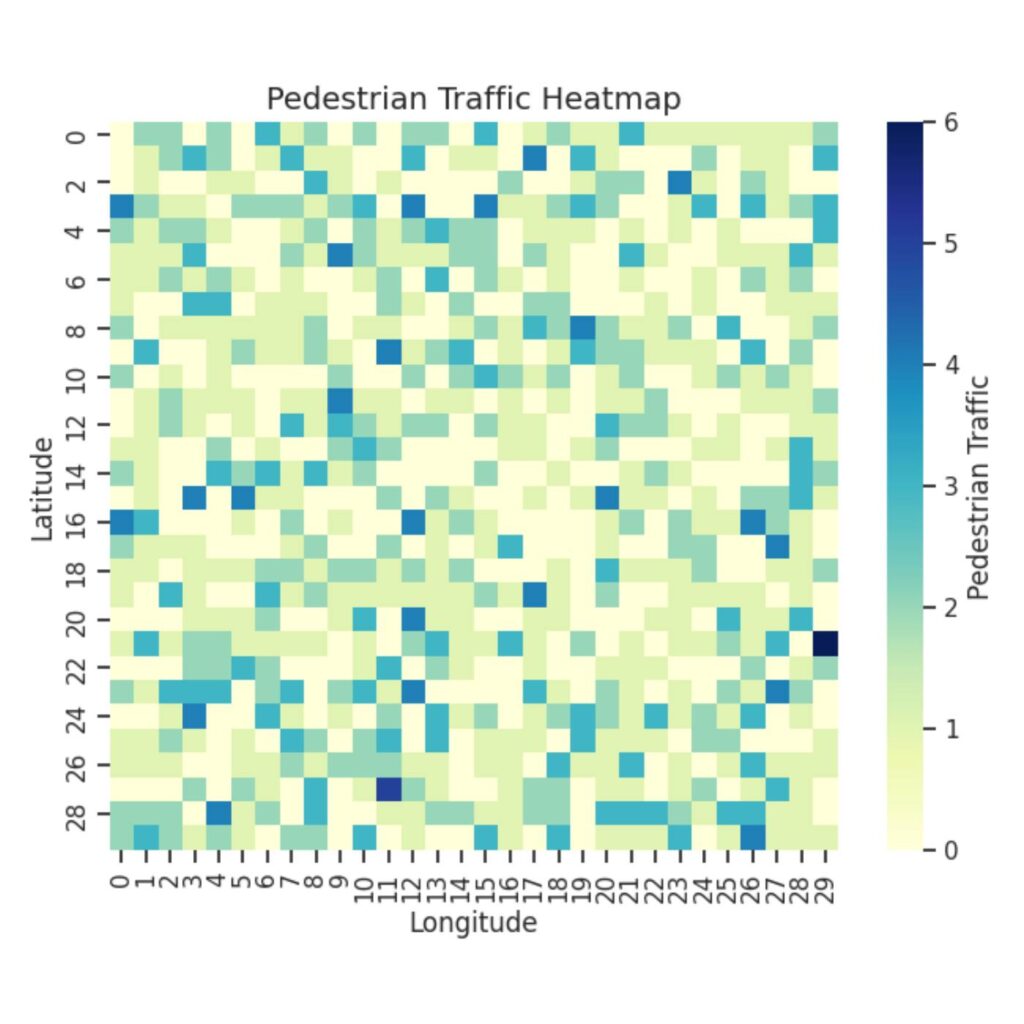
Data is everywhere. Whether it’s to track your music listening habits, analyze stock market trends, or understand scientific research, data is most valuable when it can be easily interpreted. This is where data visualization comes in: to transform raw data into clear, engaging visuals.
The Princeton University Library has a wealth of resources and research guides, including guides tailored specifically to data visualization in programming language R and statistical software Stata (often used in economics courses). However, not as many PUL research guides are currently available on data visualization in Python. If you haven’t heard of Python before, it’s a popular programming language that can tackle a versatile range of applications, including data analysis and artificial intelligence. While Stata and R are both excellent choices for statistical analysis and visualization, Python stands out for its flexibility, interactivity, and seamless integration with web development and machine learning applications.
In this article, I wanted to present a commonly-used Python library for data visualization: Matplotlib. By learning how to use Matplotlib, you’ll be able to take your data and turn it into visuals that communicate your findings effectively—a key skill whether you are analyzing survey results, studying statistics, or working on research projects!
Continue reading Matplotlib: A Quick Intro to a Helpful Python Data Visualization Library
