Most people’s New Years Resolutions, I imagine, are not about improving their knowledge of statistics. But I would argue that a little bit of knowledge about statistics is both useful and interesting. As it turns out, our brains are constantly doing statistics – in reality, our conscious selves are the only ones out of the loop! Learning and using statistics can help with interpreting data, making formal conclusions about data, and understanding the limitations and qualifications of those conclusions.
In my last post, I explained a project in my PSY/NEU 338 course that lent itself well to statistical analysis. I walked through the process of collecting the data, using a Google Spreadsheet for computing statistics, and making sense of what a ‘p-value’ is. In this post, however, I walk through how I went about visualizing these results. Interpretation of data is often not complete before getting a chance to see it. Plus, images are much more conducive than a wall of text when it comes to sharing results with other people.
My first step was to spend some time thinking about the type of data I’d be collecting. As a refresher, in my experiment, students played the Ultimatum Game: given $100 and one person to split it with, how much would you offer the other person, assuming they have to agree to the deal for both parties to keep their money? I wanted to split the responses into two categories: “positive” and “negative” mood, based on the respondent’s reported mood at the end of the game.
For this experiment, the groups are nominal (also called categorical) for two reasons: firstly, there are categories (as opposed to measuring something like heart rate, which is numerical), and secondly, there’s no ‘ordering’ to those categories, like there would be if I were to group people by education level (e.g., elementary school, middle school, high school, college, which would be an ordinal variable). Since the different groups I’m using – positive versus negative moods – are categorical, and the data I’m measuring – how many dollars are offered by the proposer – is numerical, I planned on making a bar graph. Bar graphs definitionally present categorical data along the x-axis (the mood groups) and values along the y-axis (the amount of money offered). A scatter plot, on the other hand, represents numerical values along both axes. Here’s a reference on the different types of data and the plots that suit them best.
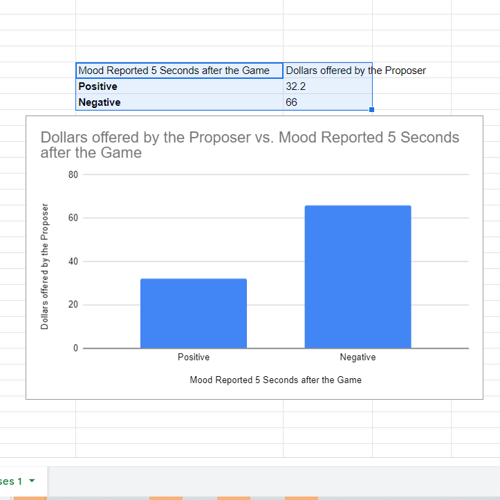
I decided I would make my graphs in Google Spreadsheet. I organized my data such that the group names were in one column and the mean values were in another. After highlighting the data and labels, I then clicked “Insert”, followed by “Chart”. Greeted with a pie chart, I clicked on the “Chart type” drop-down and selected “Column chart”, which produced the plot you see below.

The first change I made was to the title, making it more informative about the experiment and centering it in the graph. Importantly, however, what this graph is missing is the statistics I computed in Part 1: how can we visually represent the p-value, the probability that the difference in the means between the two categories is due to random chance when assuming the data comes from a single distribution of values?
A common solution here is to use double standard error bars. Stepping back a bit, the standard deviation is a measure of the variation of data: for example, it tells us if the values for the ‘Negative’ group are consistently close to 66, or if they are spread out all over the place. While the standard deviation corresponds to a population, the standard error is a similar metric adjusted to samples of data, calculated by dividing the standard deviation by the square root of the number of samples in a category. For most distributions of data, 68% of the data falls within one standard deviation (or one standard error, in a sample), 95% within two standard deviations, and 99.7% within three standard deviations. When the standard deviation is very large, for example, the range of values that encapsulates 68% of the data will be larger than when the spread of the data is less and the standard deviation is smaller.
A confidence interval (CI) can be constructed from the means and standard errors for our two categories. The CI represents a range of values in which the population mean could be. More specifically, if many confidence intervals were made from numerous samples of population data, there is a specific probability that the true population mean lies within any one interval: this is called the level and is something we define before constructing the CI. For example, in a 95% confidence interval, 95% of all intervals built on different samples of data from a population contain the population mean within them. Mathematically, the confidence interval at a given level is the range of the sample mean plus or minus the standard error multiplied by a quantity Z. Z represents how many standard errors worth of data to include, since, for example, two standard errors encapsulates more data than one. In practice, Z is defined based on the desired level: for 95%, Z is 1.96.
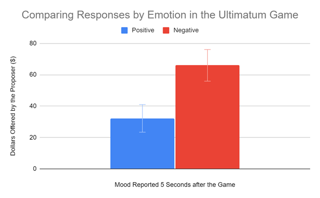
And thus, we return to double standard error bars. By adding error bars to the bar graph that indicate the range of data from the sample mean plus or minus two standard errors, this is the equivalent of roughly visualizing two 95% confidence intervals for each category! In practice, confidence intervals are much like p-values: just as a p-value below a significance threshold ‘alpha’ indicates statistical difference between two groups, when two confidence intervals don’t overlap, there is a significant difference at an alpha equal to 1 minus the level. Thus, using 95% confidence intervals is equivalent to evaluating a p-value at an alpha of 0.05.
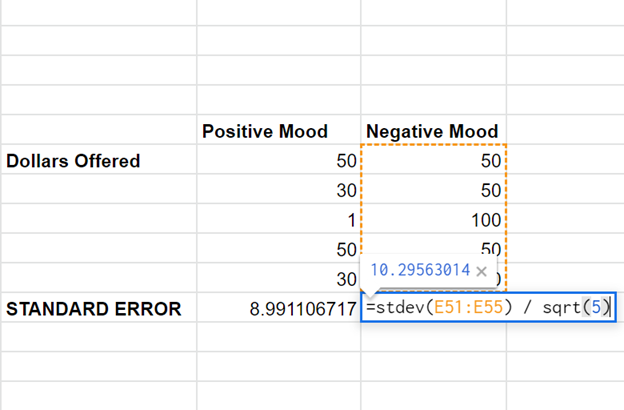
Returning to Spreadsheet, I calculated the standard error for each mood group using the STDEV function and divided the standard deviations by the square root of the number of samples in each group: 5. This is where things get a bit annoying: it turns out that Spreadsheet is not natively capable of adding individual error bars to each column, so we have to mess with some buried options to make it work. Under “Setup”, I checked off “Switch rows / columns”. Then I checked and then unchecked “Use row 77 as headers”, which magically fixes the spacing issue that appeared from switching the rows and columns. Next, I headed over to “Customize”, then “Series”, and choose the series “Positive”. I checked the error bar box and change the “Type” to “Constant”. Here’s another tricky part: Spreadsheet automatically adds AND subtracts whatever value is entered here, so to plot two standard errors, you only input the value of one standard error in this box. I typed in the value of the standard error for the “positive” mood and repeated this for the “negative” category. Finally, the double standard error bars are visible!


After a lot of statistics and some finagling in Google Spreadsheet, we have our final product: an informative bar graph that conveys statistical information about our data! In practice, running an experiment and doing statistics may look different from project to project, so it’s important to understand the underlying concepts at play. Additionally, there are many caveats: being statistically significantly different, for example, is not the end all be all to working with data. I hope that my experience with this class project has proved helpful! To review any of the material I covered in more depth, I’d recommend any of the Crash Course Videos on Statistics.
– Kamron Soldozy, Natural Sciences Correspondent

