As anyone who has taken one of Princeton’s introductory statistics courses can tell you: informative statistics and figures can and will be incredibly useful in supporting your research. Whether you’re reworking your R1, writing your first JP, or in the final stages of your Senior Thesis, chances are you’ve integrated some useful statistics into your argument. When there are a million different positions that one can take in an argument, statistics appear to be our research’s objective grounding. The data says so, therefore I must be right. Right?
The way that data is displayed demonstrates that this might not always be the case. In 2005, CNN published a graph depicting the number of Democrats, Republicans, and Independent voters who believed that Terry Schiavo should have her feeding tube removed.

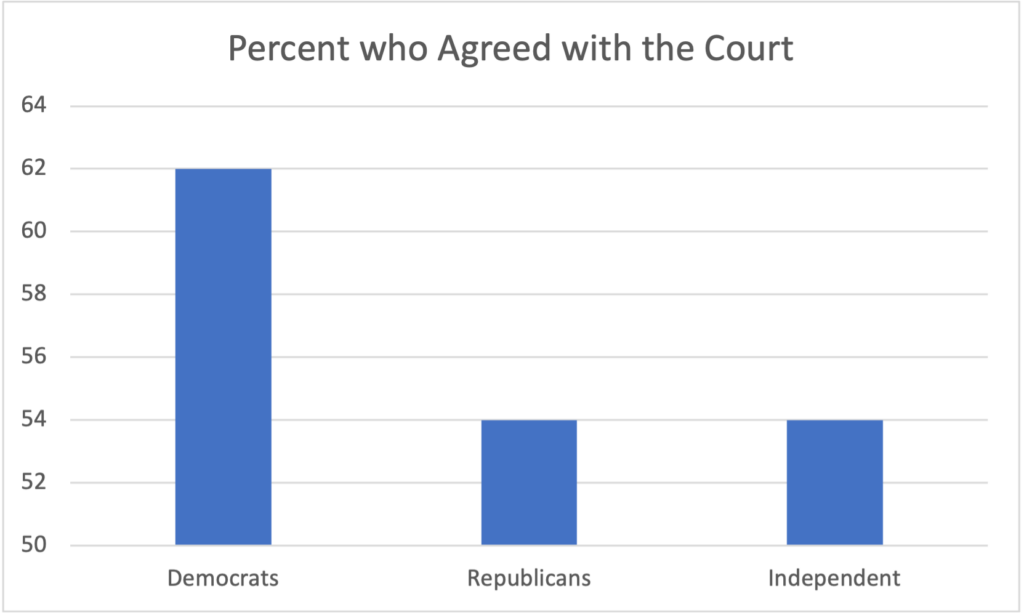
A recreation of the original CNN graph demonstrating CNN’s figure appears clear: a basic histogram with three categories for each political party and big, bold numbers indicating their respective percentages. This perceived simplicity suggests that the figure would be easy to read, and, at first glance, it appears to show a significant discrepancy: three times as many Democrats as Republicans thought Schiavo’s feeding tube should be removed! This would be an outstanding difference—what could have caused such a gap between Democratic and Republican thought?
Upon closer inspection, however, one sees that the figure is not as clear as CNN makes it out to be: the y-axis doesn’t begin at zero (as one would expect), but 50%. The difference between Democratic and Republican opinion, then, is only 8%—not extreme by any means. Why would CNN release a graph which obscures its own data? Why would they seek to exaggerate the polarization between Democratic and Republican thought? Here, the truth has been obscured, but was it intentional? We can’t say for certain. But we do know that this figure is misleading, and that this danger can easily be replicated in our own research.
How do we fight back against misinformation? Or, perhaps more pressingly: how do we avoid conveying misinformation with our own research? The answer is easier said than done: we must commit ourselves to creating honest charts and figures. This means sticking to a few basic heuristics—if you’re using a graph, the y-axis should probably start at 0, and you better label your axes (a legend is probably also a good idea).
But other areas aren’t so straightforward. When is it okay to use more complicated figures, such as a funnel plot or a rose diagram? Just because my data doesn’t show a correlation, does that really mean that there’s no pattern? There are no easy answers and, often, the chosen chart or statistic comes down to your own individual judgment. This presents the grave concern of unintentionally obscuring your own data. It’s easier to do than one might think. While there are organizations that will purposely manipulate their data to support their own incentives, often data gets obscured simply because the researcher just doesn’t have a firm grounding in statistical knowledge.
In the end, we are the ones responsible not simply for avoiding misinformation, but ensuring that our own information is honest and clear. How can we do this? The best advice I’ve gained is to take a statistics course. They may seem scary, you may have to learn some R (it’s good for you), and it may not even be required for your Concentration. Regardless, the skills you learn in just one Introductory Stats Course will most likely carry into every class you take during your time at Princeton. The skills you learn in Stats will prove invaluable not merely in your own research, but in the way you interpret and analyze the world around you. You will learn to differentiate the factual from the false, but you will also learn to take an opinion despite not having 100% certainty. As any statistics course will teach you, we can never be 100% certain about any of the claims we make. But more often than not our human progress—and our research—depends on taking a leap of faith. Honest statistics are just the foundation where we make those leaps.
– Amaya Dressler, Social Sciences Correspondent

