Matplotlib: A Quick Intro to a Helpful Python Data Visualization Library

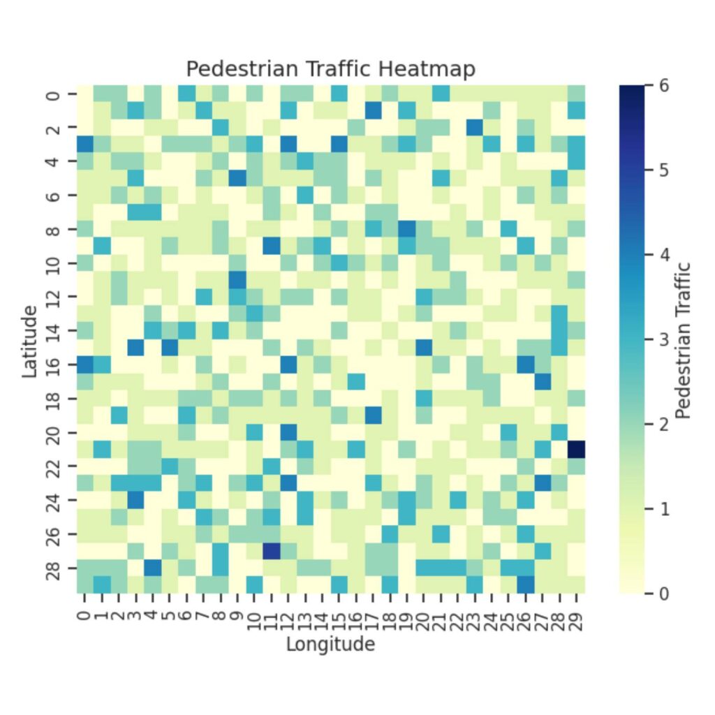
Graph of a heatmap with colors ranging from pale green to dark blue to indicate density of pedestrians.
Example heatmap of pedestrian traffic generated by the author to illustrate some of Matplotlib’s capabilities.

Data is everywhere. Whether it’s to track your music listening habits, analyze stock market trends, or understand scientific research, data is most valuable when it can be easily interpreted. This is where data visualization comes in: to transform raw data into clear, engaging visuals.

The Princeton University Library has a wealth of resources and research guides, including guides tailored specifically to data visualization in programming language R and statistical software Stata (often used in economics courses). However, not as many PUL research guides are currently available on data visualization in Python. If you haven’t heard of Python before, it’s a popular programming language that can tackle a versatile range of applications, including data analysis and artificial intelligence. While Stata and R are both excellent choices for statistical analysis and visualization, Python stands out for its flexibility, interactivity, and seamless integration with web development and machine learning applications.

In this article, I wanted to present a commonly-used Python library for data visualization: Matplotlib. By learning how to use Matplotlib, you’ll be able to take your data and turn it into visuals that communicate your findings effectively—a key skill whether you are analyzing survey results, studying statistics, or working on research projects!

Continue reading Matplotlib: A Quick Intro to a Helpful Python Data Visualization Library

Mystery Writers in Research Labs: How to Analyze Your Data

The image is to depict a study corner in the Trustee Reading Room to add the feel of a study session to the post since it is about analyzing data.
Trustee Reading Room, Firestone Library. Photo credit: Matt Raspanti.

“So what does this data mean?” My professor asked, looking at me expectantly. What does the data mean? “What does this data tell you about the cancer cells?” If he thought rephrasing it made it any better, it didn’t. I am not quite sure what I said to save face (and frankly, I really do not want to remember), but I must have said something because my professor just nodded. “When you look at your data, I want you to create a story. It may be a mystery, but then you’d be providing a certain set of clues.” 

It is very easy to get caught up in generating data, especially if the data is particularly tricky and you’re concerned about making sure it looks right, generating the right graphs, having the right axes, numbers and titles. It can be a headache. By the time the graphs are done, I would rather not look at it anymore or think too hard about the numbers. However, as lab reports and analysis questions stack up for our classes, it becomes prudent to know how to analyze these graphs. While I am not a seasoned veteran, I have a few tips that helped me approach these types of situations.

Continue reading Mystery Writers in Research Labs: How to Analyze Your Data

A Figure Speaks a Thousand Words

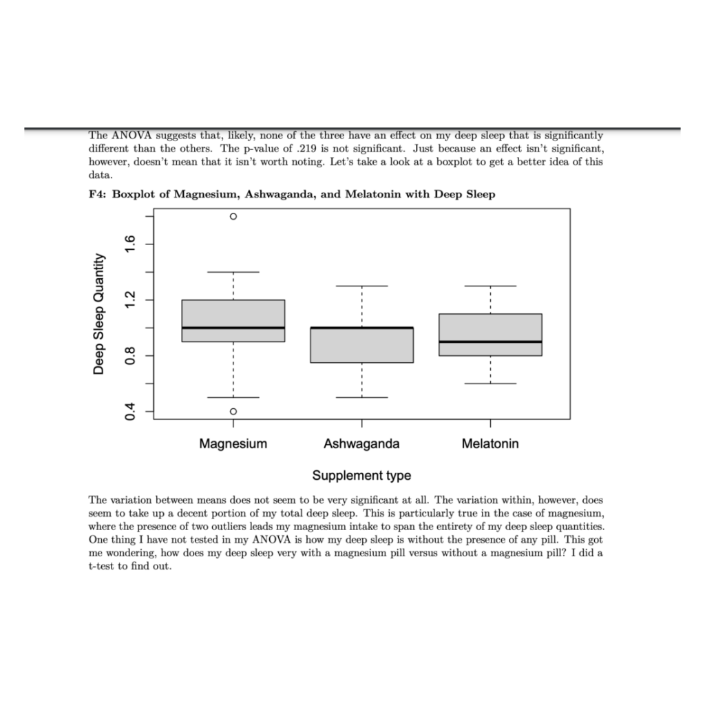
Example boxplot titled Boxplot of Magnesium, Ashwaganda, and Melatonin with Deep Sleep. The boxplot analysis indicates statistically insignificant variations among supplement types. The author describes the follow-up question after their ANOVA analysis: how does my sleep vary with a magnesium pill vs. without a magnesium pill?
The boxplot comparison accurately reflects the variation between different sleep supplements and their effect on deep sleep quantity. As seen above, the boxplot demonstrates the presence of a single outlier under the Magnesium group which could have easily skewed and misrepresented the data in another type of figure.

As anyone who has taken one of Princeton’s introductory statistics courses can tell you: informative statistics and figures can and will be incredibly useful in supporting your research. Whether you’re reworking your R1, writing your first JP, or in the final stages of your Senior Thesis, chances are you’ve integrated some useful statistics into your argument. When there are a million different positions that one can take in an argument, statistics appear to be our research’s objective grounding. The data says so, therefore I must be right. Right?

Continue reading A Figure Speaks a Thousand Words